I recently created a Red Drupal theme mockup, and thought I would make a walk through on creating the ddblock part of that mockup. This can also be used for creating a mockup for any web design featuring a slider like this one. All is all done in Photoshop, this will not be a working website. If you are looking for a great tutorial on how to actually use the ddblock module, check out my friend Ed’s blog. He has the best tutorial for setting ddblock on the web. This tutorial is just to give a potential client an idea of what you could create for them.
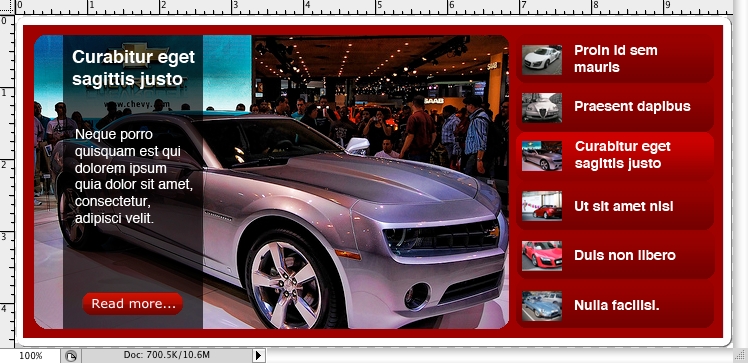
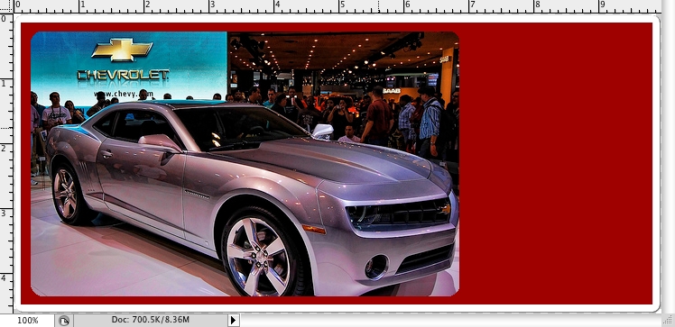
Here is what the ddblock mockup will look in PhotoShop like when we are done:
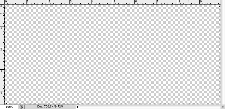
Next, you will want to select the whole background by dragging the Rectangular Marquette tool (M) across the whole document. Do not use the “select all” function in the “Select” menu, as this will not allow you to do the next step.
Go to the “Select” menu and Select → Modify → Smooth. Set the Sample Radios at 7. You should then get a nice selection with rounded corners.
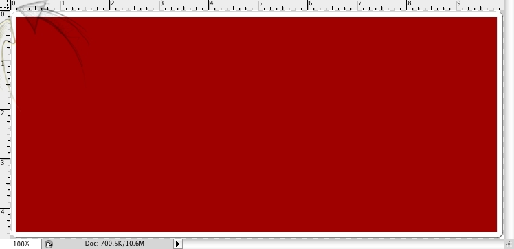
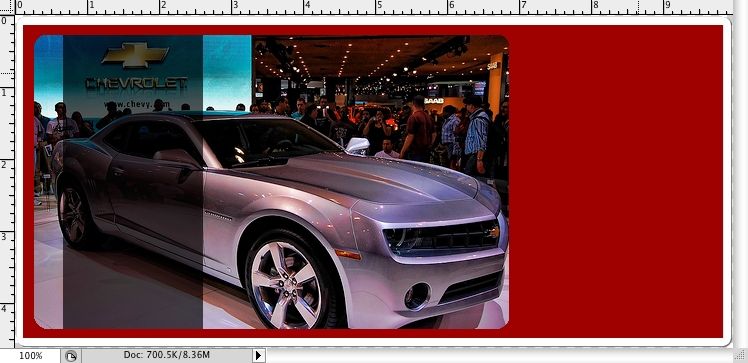
Next, create a new layer, I call this one “background2” as it will be the box we are setting everything up in. Here, use the Rectangular Marquette tool (M) again and make a box. If you are looking at your ruler, start at the first micro-inch at the top left and the side top, pull down to the same position, opposite side; top left, side bottom. (See the arrows in the image below.)
In our ddblock mockup, lets create another layer, call this one “featured.” We are going to use the Rectangular Marquette tool (M), this time to select starting top left second micro-inch and the side top second micro inch, pull down to the same position, opposite side; top left, side bottom but this time stop on the top ruler one micro0inch away from 7 inches.
Now, go to the “Select” menu and Select → Modify → Smooth. Set the Sample Radios at 7. You should once again get the rounded corners.
Go back to that 475×295 image can select it by going to the Select → All or by pressing command+a on a Mac, Control+a on a PC. To paste this into the selected area, go back to your ddblock mockup and go to Edit → Paste Into. This will insure that only part of the image that fits will be in the picture. If the image you are using is lager than 475×295, use the Move tool (V) to position the image insuring the best possible cropping.
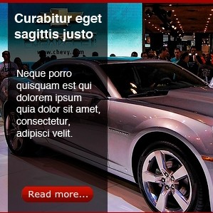
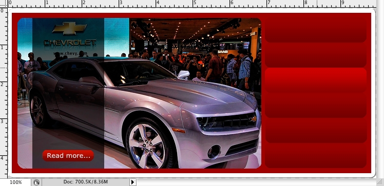
Next, we will use the Rectangular Marquette tool (M) in another layer I call infobar. The top edges should be right on the image in the featured layer, but the width should start 2 micro-inches away from the 1 inch mark and it should end three micro-inches away from the 3 inch mark. Once selected, paint or fill this black.
Next we will set the transparency of the layer itself at 66% on the Layers tool box. Your image should now look something like this:
So, now we open a ready made button, copy it and paste it on the ddblock mockup, making yet another layer. Name this layer “link1” to keep things easy.

Using the Gradient tool (G), we next shade the selection. Hold down the shift key, to insure that the gradient is properly lined up from right to left.
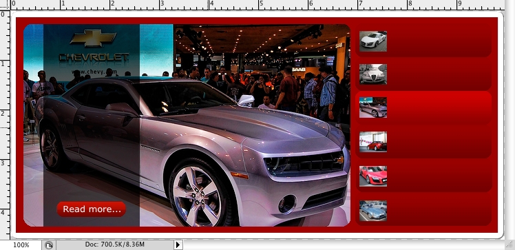
Copy this button, making six buttons total for this example. Name these layers by position, ex: sidelink1, sidelin2, etc.
Also, ddblock allows you to put less that 6 featured content nodes in the rotation. If you want to have less, do the math for size, making the buttons taller. I would recommend at 4, three at the very least, but no more than 6 total as they would get too squashed together.
Now we add the cars. The best way to do this is to find 5 more images (you already have the featured) that we can crop and shrink to 40px by 30px. Make sure they look good small. Then, Select → All (presuming you are doing these one at a time) and paste them into your ddblock mockup. You will want to rename these in the order you have them positioned, I used cars, so car1, car2, etc.
As for positioning, make sure the images are a full micro-inch from the left side of the side buttons with about a micro-inch space between the top and bottom as well.
Starting in the info bar, we add a title, be sure to use the same title on its corresponding sidebar link! Make sure it is a common web font as in a real website, the user’s computer will replace the font if a proper one is not found when loading the site. For this mockup, I used Helvetica bold, 18 pt. For the teaser text below it, I used Helvetica regular 14 pt. You should use a font and size that match your design.
Last, add the dummy titles to the buttons. Again I used Helvetica, this time bold, 14 pt. Keeping the font uniform is a better deign stranded.
Now, your ddblock mockup should look like this: